


If you would like to receive weekly updates like this, sign up here.
I must admit I have been waiting for this for a while now.
You see, the longer you study and observe the market you begin to get a feel for the way the financial media write about it.
And last week I saw one such example.
I would like to share it with you today.
Because it really is a great example of what you as an investor or trader in equity markets are up against.
Believe me, it’s not a coincidence you start to see headlines like this right when equity markets start to look toppy.
 Source – Australian Financial Review
It’s time now for you to see just how useful it is for your precious capital and portfolio to do what I’m about to show you today.
And provide further evidence that you are never told what you need to know when you want to know it…
Read on now.
Income and growth?
The article above was written to bring readers attention to the supposed opportunities that investors in Australian listed utility companies can gain.
On the surface that’s fine, it is what a paper like the Australian Financial Review (AFR) should be doing.
But for me, I see potentially something else afoot.
A classic trick set up by those mythical market makers, “the insiders”.
So, what did the article say then?
“Investors can gain exposure to Australian utilities via ASX listed companies including Spark Infrastructure (ASX – SKI), Ausnet (ASX – AST) and APA group (ASX – APA)…”
“…High income with growth, it’s little wonder the utilities are starting to attract takeover attention.”
So, in essence it’s extolling the virtues of the fabled growth AND income line to attract investors in.
This is the time when rubber meets the road.
When you read such a statement from a supposed esteemed financial paper, what should you do?
How would you know that it’s a factual statement?
Is your capital at risk if you were to take the plunge and buy in?
All very pertinent and important questions.
Here is what you do.
Go and look at the chart.
That’s right, the one thing that cannot lie to you.
I can tell you this is exactly what I do every time I read anything like the above. And in five minutes or less I know whether it’s a dud investment or not.
I understand it sounds too simple and yet; how many actually do this?
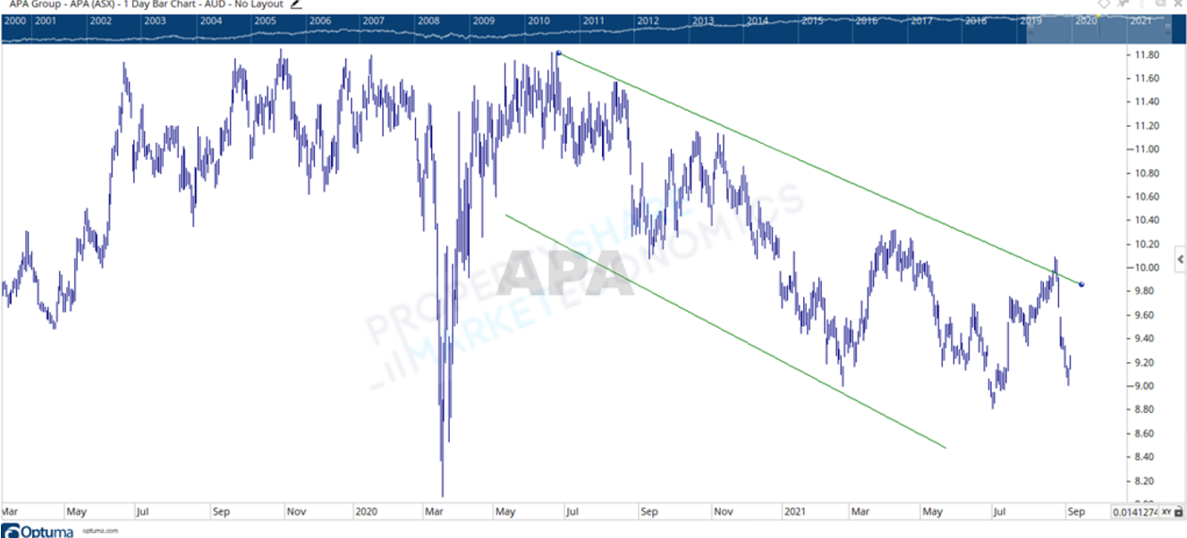
Let’s take a quick look then at two of the above-mentioned companies. Can the price action on the chart give us clues as to the likelihood of these companies’ providing dividends and growth?
 Source – Optuma
Above is the chart for APA Group (ASX – APA). Can this stock provide you income via its dividends? Yes, it can.
Can you also capture capital growth as advised in the article? Yeh…no.
You can see on the chart two angled green lines; these show the channel the price has been in for over 12 months.
And price action has been down in that time.
Capital growth? This chart is one of capital destruction to me.
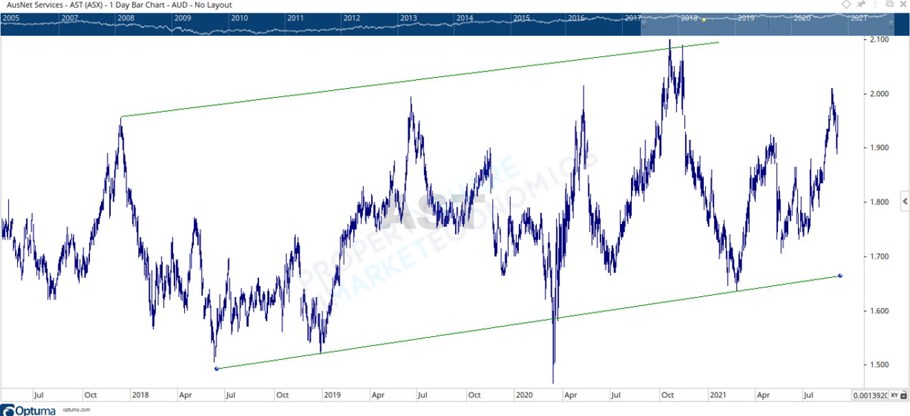
How about another company, say Ausnet (ASX – AST)?
 Source – Optuma
Here is the chart.
A different chart in terms of the channel. This one is angled upwards rather than down like APA group. Again though, where is price going here?
In 3 months’ time you can go from being up then the following 3 months down again.
This whipsawing motion in price really means your annual return in capital growth comes down to where you brought.
Is there capital growth here then? Over the long term the answer is very little, at least according to the chart.
Why insiders do what they do.
Now, perhaps you may be thinking that these editors don’t know much about investing or trading.
I honestly don’t know. Certainly though, if they knew at least the basics of investing and trading, they would be using qualifiers to those readers who knew nothing about either subject.
But it is what it is.
The onus of due diligence and formulation of a successful trading and investment plan lies with you.
I did further reading through the AFR website.
I then found the following headline below.
 Source – Australian Financial Review
I’m skeptical by nature, so I was already pensive as a read the rest of the article.
“Scentre (the country’s biggest listed retail landlord) …has been upgraded to a ‘buy’…which tips a 24.9% total return over the next 12 months for the stock, including a 5.1% dividend yield.”
“Shopping Centre Australia (SCA) Property Group, whose portfolio is focused on smaller convenience-based shopping, was also upgraded to a ‘buy’.”
So again, to the charts.
Here is the one for Scentre (ASX – SCG).
 Source – Optuma
Once again, a price action stuck in a range. And that range is declining.
Of note, at least to the mark one eyeball test, this range is hovering around the 50% retracement level of the waterfall crash this stock experienced between February and March 2020.
18 months later those who held stocks prior to that drop have only seen approx. 50% of their money lost returned to them.
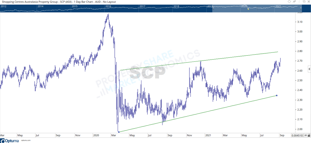
And for SCA property group?
 Source – Optuma
The chart looks slightly better as it’s an ascending channel now, but again the large scale of whipsawing experienced by shareholders means your gains are predicated by whether you brought near the top of this channel or nearer the bottom?
Yet again, the holy grail of securing both dividend income and capital growth is behind the headlines.
They are designed to elicit an emotional reaction from you which leads you to buy and sell in the way they want you to.
I’ve learned this the hard way.
When markets approach key highs during the year, you’ll start to see more and more stories like this emerge. Can these insiders be responsible?
The way they work is to release news that helps them, and not you.
Generally, this news hits the media right when they want to get out. To achieve this, they need a new tranche of buyers who together can create the volume large enough for them to sell out.
Is this what’s happening here?
Maybe it’s a coincidence? I’m seeing things that really aren’t there.
Look, I could very well be misled with my assumption.
But as I continued to read the article, a small sentence caught my eye.
“…industrial funds giant Goodman (ASX – GMG) has soared so much its valuation is now looking ‘stretched’ according to an analyst.”
Again, let’s bring up the chart.
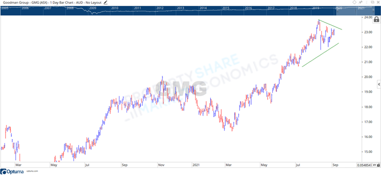 Source – Optuma
Do I agree that GMG has gone on a run? Yes. Do I agree you’d be buying the top or near to it? Sort of.
In technical terms, what we see here is an ascending triangle or wedge pattern (see green lines) across all time new highs. This pattern set up is considered bullish!
So, why would you try to talk folk out of even considering GMG as an advisable investment?
Well, what if you want a window to buy at a price that would prove cheap should a breakout up from this wedge happen?
In that case, you would benefit if a media source basically wrote a ‘stay-out ‘article, to allow them to position themselves unfettered.
Sorry, I remain skeptical.
But let’s focus on you. What can I offer to you that allows you to take charge of your investment journey and decide for yourself the next time you read a similar article?
Nothing beats education.
Get educated with the Boom Bust Bulletin.
Here you will learn the history of the 18.6-year Real Estate Cycle, why it continues to repeat to this day and help guide you to the opportunities it presents as the cycle turns.
We regularly cover the technical aspects of listed stocks in an easy-to-understand manner.
Because believe it or not, to invest with the real estate cycle, the listed companies above are exactly the type of stocks to watch.
And on each one I’ve shown you here, what’s missing is when it is time to buy and what that signal looks like.
So that you can indeed have the benefits of increased capital growth and income.
Let the Boom Bust Bulletin teach you how to do it in a simple and easy to understand format.
That way, you are prepared next time you read the financial media. You don’t need to read between the lines like I have, just bring up a chart and learn to read what it’s telling you.
So, you can invest with confidence and at a time and price of your choosing, not theirs!
And all for $4USD a month.
Simply amazing value.
Don’t wait any longer. Develop your chart reading skills to take advantage of the stock markets.
Oh, by the way, what did I find when I opened the AFR website this morning?

Source – Australian Financial Review
Where’s my charting package?!
Best regards,

Darren J Wilson
and your Property Sharemarket Economics Team
P.S – Find us on Twitter under the username @PropertySharem1
P.P.S – Go to our Facebook Page and follow us for right up to date information on the 18.6-year Real Estate Cycle.