


If you would like to receive weekly updates like this, sign up here.
A recent Bloomberg article is the reason for this week’s blog. I found it well-researched with reasoned arguments and some fabulous charts too.
Inside, it speaks about the obsession when it comes to property across the globe.
But that’s not why I’m writing about it.
You see, the author wrote that he once challenged a young man at a UK conference who told him he can’t understand why anyone today would invest in stocks, like the baby boomer generation did.
The author thought he was an idiot to suggest such a thing!
However, this isn’t one of those ‘stocks are better than property’ debates.
It was what wasn’t written in this article that’s key.
I would like to show you just how prescient Property Sharemarket Economics (PSE) research of the 18.6-year Real Estate Cycle and it’s timing truly is.
Unbeknownst to the author of this piece, his lack of cycle timing means you would be gravely disadvantaged if you followed the advice given.
Are our UK brethren idiots? Are they missing out by investing so heavily in real estate?
And more importantly, would you change your investment behavior based on its findings?
Let’s find out.
Are you obsessed like this?
The article is entitled; “An Englishman’s Home Is His Castle (and His Debt Burden)”.
The premise is the following.
“Americans think I’m mad when I say they aren’t obsessed with housing the way the British are. Americans are, after all, obsessed by house prices. But it’s true. Brits have never taken to the stock market with anything like the same excitement.”
“They tend not to think of themselves as budding entrepreneurs or Warren Buffett’s. But they all seem to be convinced that they can make a killing in real estate.”
The idea here is that residents of the UK have traditionally been far more inclined to invest their wealth into property.
And that in the US, it’s the Sharemarket that provides the best return on investment over property.
The charts provided were revealing.
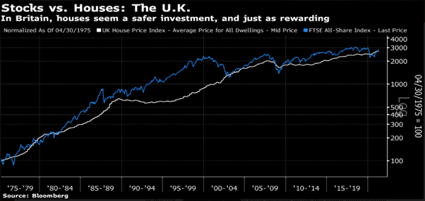
Source: Bloomberg
The white line represents the UK house price index. The blue line the FTSE index. This, like the rest I’ll show you, are relative comparison charts, hence both lines start at the same time and place.
Which isn’t realistic, and can distort the true facts, but it’s what we have.
So, as the author purported, it seems little difference in relative performance across both types of investment. Hence the lack luster appeal of the UK stock market it seems.
Different story in the US though.
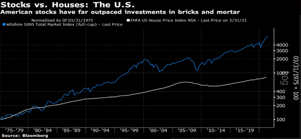
Source: Bloomberg
Same type of chart here, but the difference between houses and stocks is very stark.
Maybe the author had a point? At least from the US perspective, investing in property has been a losing bet compared to stocks!
While our UK cousins are probably better off investing in real estate.
Well, that’s it then, the juries in.
Not so fast!
Learn to see what is unwritten!
There are mitigating circumstances to be understood here.
There is far more land available in the US as opposed to the UK. Most homes in the UK are owner occupied, so they stay off the resell market for decades.
Plus, its property friendly laws and regulations (see the current stamp duty holiday there).
But not once was the word ‘timing’ every mentioned in this article.
But I need to show you this. It’s your main takeaway here.
From the article (note the words in bold).
“There’s another important difference about housing investments; leverage is cheap and easy to come by… This means gains will be impressive compared to stocks”.
“But it also means that the potential downsides can be too easily ignored. Housing crashes are disastrous on the rare occasions when they occur because they cause leveraged losses for people who cannot afford them. With debt, a “crash” doesn’t need to be so bad in price terms to have a severe effect.”
“London house prices also had long periods when buyers could only sell for a loss — and having taken out massive mortgages, they were often in negative equity and couldn’t sell at all…people with growing families found themselves trapped in rabbit hutch-like London flats they had bought straight out of college to “get on the housing ladder.”
This chart helps explain these comments.
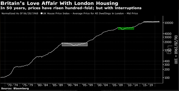
Source: Bloomberg
Here is your advantage, stark and irrevocable.
The knowledge of the real estate cycle.
Those long periods where sellers could only sell for a loss are shown via the white and green rectangles. Notice anything?
They represent the end of the 18.6-year Real Estate Cycle and the subsequent crash in property and stock markets, and economic recession.
Do you call a reliable and repeatable event 18.6 years apart on average as “rare”?
If you are interested in discovering more about why the cycle averages 18.6 years in length, take a look at this break down Phillip J Anderson provided for members of PSE here.
Do you feel that by knowing the timing inherent in the cycle you could avoid such massive mortgages that resulted “in negative equity and couldn’t sell at all…”?
You can know this, in advance, before it happens!
Make this knowledge your investment advantage. Another thing I noticed on an earlier chart too. The relative comparison chart helps disguise it to some extent.
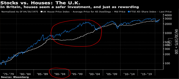
Source: Bloomberg
I included this chart above, but this time I’ve outlined a few things.
First, note the years circled below. 1990 to 1994 was the end of that 18.6-year UK Real Estate Cycle. That’s 4 years of economic recession, and credit being removed from housing speculation, which leads to falling land prices.
Now notice the large red circled area above it.
Can you see the large divergence between the two curves? It took half a decade for UK land prices to regain their previous highs. And yet the UK stock market bottomed first and then advanced.
Now who’s laughing?
Those UK investors who knew their timing were all in as the stock market continued to make higher bottoms, proving that the outlook 12 months in the future was being priced in.
You can’t be this blind to the opportunities as they arise, they can be life changing.
The key here, is the timing. That’s what I see when I read these.
And it’s that knowledge that gives me so much confidence to invest with the cycle, and not against it.
Do you know when it’s best to be most exposed to real estate? Or when its best to be in the stock market, or indeed out of it?
Because the author of this doesn’t. Yet he is trying to make the reader think he does.
Should you do both, despite the arguments made in this Bloomberg article?
Confused yet?
I have something that can help, it’s my Boom Bust Bulletin.
It helps explain the 18.6-year Real Estate Cycle, why it repeats and, most importantly, the timing.
You will be able to “see the cat” for yourself. That’s the term we like to use here at Property Sharemarket Economics to describe the ability to see what’s deliberately hidden from you.
Ok, want one more chart?
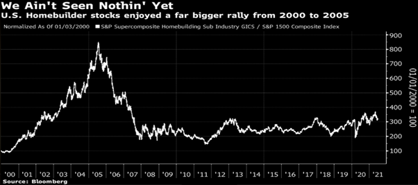
Source: Bloomberg
This chart was used to demonstrate why it’s better for US investors to stay away from property if they seek outsized gains.
Have a look at the left-hand side of the above chart.
Will 2001 to 2005 repeat for US homebuilder stocks? And if so, when will it repeat?
Let the Boom Bust Bulletin show you the answer.
All for a few cups of coffee a year.
Incredible value folks!
Sign up now.
Best wishes,

Darren J Wilson
and your Property Sharemarket Economics Team
P.S – Find us on Twitter under the username @PropertySharem1
P.P.S – Go to our Facebook Page and follow us for right up to date information on the 18.6-year Real Estate Cycle.